Saturday, 8 December 2018

IDEAS REFINEMENT AFTER CRIT

TODAY'S PLAN
- try making the beat
From what Ben suggested, I tried following Youtube videos and created my own beat. It was a difficult task for me as this is my first time creating a beat and using the software. I used a melody I found online and added other beats to modify it into a lo-fi like track. I tried my best to investigate on how the whole thing works, but as my skills is limited, I only made 3 and a half bar. I think i will continue making it tomorrow. 

- re-decide on which 2 tracks to choose 

- research on the history and cultural background of lo-fi beats

- photoshop the holographic strips onto the sleeve and see how it is going to look like if they are being replaced by foil after screen printing

Friday, 7 December 2018

FIRST CRIT ON INITIAL IDEAS

NOTES (Ben and group mates' suggestions)
Find an Artist 
Research
Culture
Grids
Sample text
Make your own beatàholographic papers
2 tracks in the inside
Screen print foil of diff colours
Ombre effet on bg
Names of software or machines àstickers
Samples of their inspirations


Today, we did our first critique on our initial ideas of the album cover. I showed my crit group and Ben my initial ideas. Ben said that I should do more research on the cultural background and the history of the music genre instead of keep on researching on how other people designed album covers. I realised that there are two approaches when doing research. Th first one is what it did, which is research on some physical examples of album covers. Another one is to research on the information of the music-genre. As I went for the wrong approach, I did not have much inspiration and ideas, that is why I only have 2-3 concrete initial ideas for the crit.

After, the critical, wrote a list on what to finish today and what to do tomorrow.

WHAT TO DO TODAY
- research on how to make own lo-fi beats

- find holographic foil on amazon 

WHAT TO DO TOMORROW
- try making the beat
- re-decide on which 3 tracks to choose 
- research on the history and cultural background of lo-fi beats
- photoshop the holographic strips onto the sleeve and see how it is going to look like if they are being replaced by foil after screen printing


Thursday, 6 December 2018

TEXT + FONT TESTING + NUMBERS

TEXT I USED FOR EXPERIMENTING
By mixing heart touching piano, organic percussions and realistic ambient sounds and textures, idealism manages to reach deep into the hearts of the listeners, and take them on a self-reflecting musical journey.
Emerging from the lofi/chill hiphop community, idealism has found a way to take the genre even further, by focusing on making the listener feel multiple emotions in one track, by combining techniques from ambient, jazz, blues and hiphop.

Idealism has played drums most of his life, but only recently has he picked up the piano. In 2 years, idealism has managed to create a new original style, and has gathered a large fanbase, that always eagerly waits for a new release.
As stated by Dope Approach, from an article on 'amaranthine' EP: 
" One of the things we most like about Idealism’s latest offering, in fact, we could say this for most, if not all of his work – Is the emotional impact it has on the listener, allowing you to transcend to a place beyond time and space – as far into the dreamscape as possible. It is the ideal escapist sound, reserved only to those in the ‘know’ "

His main musical inspirations range from artists like Atu, Submerse, Harris Cole, Carmack, Mndsgn; to movie soundtracks, like the one from 'Spirited Away' by Studio Ghibli; to even video games, like The Legend Of Zelda.

Combining all of these and his life experiences, idealism created the massively successful 'hiraeth' EP, which was #1 in the Piano category of Soundcloud within two weeks of its release.

His latest release, 'amaranthine' EP, combines ambient, lofi hiphop, and synthwave, to create a piece of work that is not only original and interesting to listen to, but it also showcases idealism's flexibility to change styles and try out new things.


FINAL TEXT
I decided not to use a long text as the spaces won't be significant. Therefore, I use 
"MUZAKA AND GOLFERS  /  A COOL PLACE TO HANG OUT" which are the two tracks that I have chosen.
- more significant spacings
- more related to the album
- easier to read when it is duplicated and stretched


FONT TESTING
I looked up fonts from dafont.com and found these three fonts that i thought suits well with the lo-fi beats aesthetic. Flatline looks electrical, while Error and Hacked look glitched. I then used them on the text in Illustrator. I expanded the text and stretched the text to make the spaces more obvious to form significant rivers. 

FONT: ERR0R
As the typeface itself has a lot of spacing between each stroke, it did not work as the rivers cannot be seen clearly. 

FONT: HACKED
The spaces are more significant than Err0r, but not perfect. 

FONT: FLATLINE
I can easily see rivers created. I may go for this font. 

After doing more and more research

FONT: VAPORWAVE TEXT/ AESTHETIC TEXT
Uppercase artist name
IDEALISM 雨ずホ

IDΞΛLISM (雨ずホ)

IDEALISM】

Lowercase artist name
idealism ワ宛雲

idealism (ワ宛雲)

idealism】


Upper case track names
NAGASHI コず欧

NΛGΛSHI (コず欧)

NAGASHI】


LONELY ゼビ

NΞLY (ゼビ

LONELY】


Lower case track names
nagashi フ内凹

nagashi (フ内凹)

nagashi】

lonely 曖横挨

lonely (曖横挨)

lonely】

 At last, I decided to go for uppercase for the artist name and lowercase for the track titles. This is because it is the artist who has produced the two tracks and I thought that the two songs should be something that is under the name of the artist's.

NUMBERS
lo-fi chill beats playlist was posted April 23rd, 2013 by Chillhop Music, a channel devoted to showcasing the style featured in such playlists (shown below). The playlist has gained over 2.8 million views.

April 23rd, 2013

GRID


BITMAPPING

Today, we experimented with bitmapping in photoshop. I experimented with the glitching rivers that i created last lesson. I strengthened the glitching effect by using purple and green for the two layers. 
I then experimented with putting images on text. I applied overlay effect on the image and it turned white on the text. I really like the result of the big contrast between the text and the image.

I then duplicated the image and applied darken effect to further develop that glitchy effect.

I added another collage that I did onto the document to add more texture on it.


playing around with the layout.

I duplicated the background layer and played around with the colours. I add a new layer of red onto it and it turned out to be more glitchy and I really like the result. 

As this is for screen printing, colours will overlap throughout the printing process. I am thinking of using blue, red and green. So that when the blue overlaps with the red, purple will be created. Thus will result in more colours created only using three layers. It turned out to be blue tinted. This made me think about what colour tone I want for the outcome. I personally like the old one more.

I finally figured out how to bitmap the images in the right way. The result was quite pleasing as the thresholded image created a grained effect which further added texture to the glitchy effect.

I turned down the brightness of the red layer.


Wednesday, 5 December 2018

HOLOGRAPHIC PAPER EXPERIMENTS


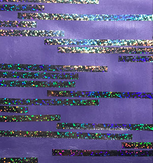
The holographic ballon ribbon has arrived today and i did more experiments on the distortion collage idea. The purple paper was too light for the hologram effect to stand out. Therefore, I tried using black paper. The result was better.

I then scanned them for tomorrow's lesson. The glue was visible, but the scanned version for the black one is quite good. the contrast between the shiny holographic paper and the black paper creates a strong visual image.

 I then had an idea of only scanning the holographic paper in the scanner. It turned out to have a white background and i really like the result. Therefore, I then stuck the holographic papers on a white paper and scanned it.


SCREEN PRINTING INDUCTION

paper screenprint> yellow n green
fabric> blue

white for textiles yellow for paper
brown tape> name, course, date
*date> when the screen is preserved until
*check dates*
can take more then one if u hv more than one colour

screens locations:
screen drawing, 
screen storage(left textiles, right paper)

  1. look for old dates(in the past) / blank frames> can use
  2. reserve the screen for yourself> find a roll of brown tape> stick it on frame> name, course, date(one week into the future)*7days
  3. remove the screens off/ clean it yourself before using (not clean it after using)
  4. bring screens into screen stripping(down the corridor, opposite to screen drying)
  5. use wet tissue to clean the mask
  6. clean screen 

how to remove screens:
take off the tape
put the screen into the sink
left chemical first
right chemical second
power host: turn right, on/ off
after washing

degreasing
sink outside> soap on sponge> rub on screen> thoroughly get everything off> rinse it with water
need to dry it in screen drying room(15-20mins)

coat screen with emulsion
  1. flat side facing us put it against the wall
  2. choose coating trough of the right side(hold it against the screen, leave a bit of border on the sides of the yellow), if theres no right size, place the screen horizontally against the wall n pick a larger trough
  3. uv reactive emulsion(light sensitive paint) in black bucket>wear plastic apron n gloves if u want> pour it into coating trough(amt: depends on how big the screen is)> get an even amount on trough> close the bucket with lid
  4. apply emulsion on screen> hold handle of trough> pop coating edge against the screen> tilt until emulsion running onto screen> bottom to the top(thin film)> tilt down to hv them drip back in(drip in the edge, use kidneys, scrape off anything u dun want on both sides
  5. put back excess emulsion into the bucket using the kidney
  6. check coat of screen at the lightbox (even, light through)
  7. put screen in the drying cabinet (15-20mins)
  8. clean coating trough with sponge with water> pop it back onto the rack
  9. exposing positives/design onto screen(positives can be on acetate, paper or tracing paper) black blocks the light
  10. design facing up, leave gap between two designs, between design n frame(things on top of screen won’t affect it)
  11. pull string on top of screen
  12. when finished, wash both sides, wash design> get light coning through the screen on positives> quick rub with sponge
  13. put it in drying room(15-20mins)
  14. put brown tape on the yellow borders, cover unwanted design(yellow)with brown tape
  15. grab acrylic paint
  16. add acrylic printing medium*get it from shop* 2/3 medium, 1/3 paint(slow down drying time of acrylic) (more ink less binder, more opaque) (more binder less ink, transparent) if too watery> more ink *have to pay for pot* *bring in own container with lid* can use acrylic with no names on it
  17. work from light to dark
  18. fit too n bottom screen on the bars of the vacuum tables
  19. lock with feet add papers to add more pressure
  20. grad a squeegee on the walls(squeegee has to be wider than design
  21. pour paint on the screen bottom
  22. higher the screen 
  23. flooding= fill screen with paint> push ink to bottom to top with squeegee 
  24. lower screen parallel to table
  25. use squeegee tilt it towards urself push it
  26. slide paper underneath of the registration paper
  27. print
  28. can mark paper with tape to mass produce

overlays and overprints
colours sit on top of each other to make a new colour 

can draw positives by hand(ink pen, china pencil)/ cut black paper
if there is too much emulsion on it, use the coating trough, put screen back against on wall, use trough to scrape off the unwanted emulsion
[light, water sensitive] store in dark dry environment 


Tuesday, 4 December 2018

GLITCHY EFFECTS

GLITCHY EFFECTS
In a technical sense, a glitch is the unexpected result of a malfunction, especially occurring in software, video games, images, videos, audio, and other digital artefacts. àsimilar to lo-fi beats which are  imperfections of the recording and production are audible


It is made by either "capturing" an image of a glitch as it randomly happens, or more often by artists/designers manipulating their digital files, software or hardware to produce these "errors."