Showing posts with label OUGD504 (SB1). Show all posts

Thursday, 28 November 2019

(SB1) FINAL OUTCOME MAKING

I printed two copies of the concertina.

For the first copy, I tried using the creaser in the digital print room, it did not work properly as the creases were too thick and the creaser in the print room is slightly offset. Therefore, I decided to try put it aside and try folding the pages on another copy.


For the second copy, I tried scoring the pages with a cutter. it kind of worked, turned out really clean, but still not perfect.

I then stuck the pages together with the tabs overlapping the third pages, I tried to align the words and it was quite successful.
On the other hand, the final product did not turn out looking like a concertina at all. All of the pages were shifted to the left.

I was so disappointed. I spent so much time worrying about the printing outcome and tried my best to fix the document and get prepared for printing. But then it still did not turn out perfectly. The 'concertina' did not even fit into the box and everything failed.

CONCLUSION
- when alignments of the text are accurate, the pages are shifted.
- when pages are aligned well, the alignments are shifted.

FINAL EXECUTION
As this brief emphasises on the production method, I decided to give up the content accuracy.


I therefore decided to in order make the book at least looks like a concertina, I gave up the alignments of text. I used the first copy (which is being creased not properly) and tried making it again, despite all the wrongly creased marks. It then turned out to finally looking like concertina, however, the users will not be able to read the text properly. It can then finally be placed inside the box properly.


Wednesday, 27 November 2019

END OF MODULE EVALUATION

In terms of my practical work, I think that making a book is really time consuming. Everything has to be set up accurately for the printing part and I know that I am not familiar enough with the preparation process. I will have to practise more and try making more designs for print in the future to get prepared for my future career. 

Compared to last year, I am actually really disappointed with my time management skills. Last year, managing time well and planning out everything was my way of distressing. I used to write down my schedule everything and a to-do-list every week to keep my work on track. However, I tend to be less strict to myself. Maybe due to the fact that I was stuck with my ideas, I tend to procrastinate and deal with everything at the last minute. 

Hopefully, I would be able to improve my time management skills and do what did I last year, planning everything out. For the next brief, I aim to be hard working as last year and finish off everything at least tow days before the deadline. 


Also, I feel like I have been to shy. I am just too scared to ask people for help. However, I realised that actually if I try to tell people my issue that I am dealing with, people will actually help me and give me useful advice. There is no need for me to be afraid of asking as tutors, technicians, professors are here in uni to help us and give us advice for us to improve. Therefore, I really hope that I can be more daring to talk to people and ask people for help. 

(SB2) BOX TEMPLATE (PRINT)

As I do not want the book to look like a sandwich, I decided to make a box template for tomorrows printing session. The box to going to hold the publication. 

1ST ATTEMPT
2ND ATTEMPT


(SB1) FINAL PREP FOR PRINTING

The printing process is definitely not the best choice. I knew that the digital printing service from our uni does not support printing a 13 A5 pages concertina. I was going to buy a long piece of paper myself fro printing my publication out in the right size so that I wouldn’t have to cut it into half and sticking them together. However, I realised that even if I got the long paper, they also don’t support printing the concertina because the maximum length that they could print is 1.3m which is shorter than my whole book. I also tried to look at printing companies if they could print a long concertina, most of them only do mass production and the prices are out of my budget. I even tried asking my Leeds Uni design friends if they could give a hand, it ended up not successful as they also do not support printing a long concertina. 

On the printing day, as James was not in, I told Steve about the problem I am having and he offered help. He asked me to go meet him the dayafter at the comuputer resource room and we can get it sorted together. He also helped me to book digital print again so that I can print the final outcome before the dealine. I am actually so thankful that he was being so nicely and helpful. Steve showed me the best possible way to make the concertina and it was so complicated. 

I then came in to find Steve today to get the printing document sorted. We figured it out at the Mac suites and it was so mind blowing for me. Steve suggested the best possible way to recreate the document. He created a SRA3 and tried putting a few pages of my concertina on to see how many pages can it actually fit in. It turned out, after adding the bleed, it can only fit in two pages on each SRA3 paper.

He then created two A-masters. One for the fronts and one for the backs. For the front pages, he added a tab on the right spread and for the back pages, he attached it on the left spread. The tabs are going to be used to stick it to the next page so that the glue or the glue or the tape will not be visible. However, as the tab is going to be overlapping the front pages, we have to actually use a tiny part of the next page as the tab so that it will not be covering up the words on the next page. This part is actually so complicated to make as we have to measure the bleed as well. 

In the end, we nailed it. The document is print-ready for tomorrow. 


Friday, 22 November 2019

PRE SUBMISSION BREIFING

A3 FOLDER:
- publication 
- submission label 

BLOG
- end of module evaluation 
- final outcome (website) 

Submission requirements
page4image3603271664
• Studio Brief 01: Design for Print Submission requirements:
  1. Blog – PDF uploaded to estudio via dropbox.
  2. Design Boards – PDF uploaded to estudio via dropbox.
  3. Final Outcome: Printed Publication physical hand in, A3 folder.
• Studio Brief 02: Design for Screen. Submission requirements:
  1. Blog – PDF uploaded to studio via dropbox.
  2. Design Boards – PDF uploaded to studio via dropbox.
  3. Final Outcome: Digital outcome evidenced on blog.
  • Submission label, found on estudio. Printed and submitted in A3 folder.
  • End of module evaluation for module as a whole. Evidenced on your blog


Monday, 18 November 2019

DESIGN BOARDS BRIEFING


RATIONALE 
  • Froms 
  • Why this brief 
  • Critical engagement 

RESEARCH
  • Conducted 
  • Methods 

INITIAL IDEAS 
  • Sketches 
  • Tests 
  • Mind maps 
  • in response to your brief, not initial ideas for the brief 

DEVELOPMENT 
  • Experimentation —> explore a range of your initial ideas 
  • Iterations of the same ideas 
  • Aim of development —> what were you trying to achieve 
  • If ideas changes significantly, evidence this on development pages 
  • Evaluate process 

FINAL OUTCOME
  • Evaluating development 
  • Refinement 
  • Photographed well and clearly communicates ideas 
  • SB2: mock-ups, prototypes 

EVALUATION
  • Reflect on brief (what worked, what didn’t) (1 n 2 separately) 
  • Potential and limitations of production methods 
  • Evaluate against learning outcomes

TOP TIPS
  • Use images with captions - evidence your process
  • Evaluating points: Why? The results of this?
  • Say it how it is - what happened / don't brush past mistakes - evaluate what happened and how you solved it
  • Story - linear narrative
  • Edit: to clearly communicate process. If there is a paragraph of text, make key points clear (bold?). Make process as concise as possible.
  • Framework: evidencing how you have met each learning outcome.

Monday, 11 November 2019

(SB1) MY FINAL DECISION

STRUCTURE 

Concept: a physical city escape
  • Concertina - no nails 
  • Wooden cover - city escape 
  • Foil vacuum bag holding the book - city 


CONTENT
  • Blurred edges 
  • Symbols throughout the text 
  • Replicated thin words 
  • Dreamy photos 

(SB1) LAYOUT (CITY VS NUNNERY)

NUNNERY

  • Spacious    

Images were placed next to each other in a really sparse way. The gaps between each photos are relatively wider than the ones I used for the city images. This is to create that spacious and airy aesthetic. 

  • Continuous 
I avoided placing images within one page. With images placed across pages, it makes the whole book look more spacious without any limitations in placing images. 

  • Zoomed in images 
To show the details of the images. During the visit to the Chi Lin Nunnery, I ten to look at every detail of the place as I was so into the atmosphere of the place that my mind just went blank and all I did is looking around and observing stuff around me. 


CITY

  • Packed 
I placed the images of the city in a packed layout with comparatively narrow gaps between images. This is to emphasise on the idea of the suffocating city and how buildings are structured densely in Hong Kong.

  • Repetitive
The repetition of images is to communicate the idea of how the buildings all look the same and look like they are duplicated from each other. 

TEXT 


  • Thin 
To make the aesthetic clean subtle. 

  • Replicated 
To create the airiness and emphasise on the details of the environment. 

SYMBOLS

Concept: guides and instructions were not visibly shown to visitors on signages. However, we automatically behaved really well when we were in side the area. They were like they were there, but they were not. 

  • Arrows 
To guide people reading the text smoothly. 

  • Circle 
To indicate both the start and the end 

BACKGROUND COLOUR


I did some research on what is the most calming colour to human and the result was blue. 
  • Light blue 
  • Dark blue  

Dark blue looks better with the tone of the images. 

(SB1) IMAGE MANIPULATION - NUNNERY

IMAGE MANPULATION 
Concept: making images really blurry and soft to create the dreamy aesthetic which seems unreal. 

I looked at tutorials on Youtube and found out that this has the best effect that I would like to achieve. The images are blurry, yet, the details are still visible. After adding the High Pass effect, the white parts of the images turned really bright and looked really glowy. This is exactly how I wanted the images in my book too look like in order to create the feeling of a utopia where everything is really soothing and makes you comfortable when you look at them. 
I would be photoshopping all of the nunnery images in my book into this aesthetic, maybe with some text with thin fonts and spaced out kernings to make audiences feel really comfortable when looking at my book. 


After experimenting, these settings work the best for all of my images. Since the settings from the tutorials didn't work perfectly with my images, I turned the brightness and contrast up a bit to make the images 

examples of the 'before and after'. 

The images turned out to look a lot warmer than the original ones and this is out of my expectations. However, I really like the outcome as the yellow tint tend to look more comfortable to human eyes.

I also tried ways to make the photos look even softer by blurring out the edges of the photos. The outcome didn't turn out looking good, however, it did gives off a more soothing aesthetic when people look at them. Therefore, I decided to think in the users' experience perspective and go for the softened edges version for the final outcome. 


Friday, 8 November 2019

(SB1) TYPESETTING PROCESS


  • Tracking +130
  • Different fonts, tracking 

Helvetica VS Minion Pro
I tried using different fonts and tracking for the text on the city and text on the nunnery. I think that the justification is not bad cause I used Helvetica and -ve tracking for text on city, while Minion Pro and +tracking for text on nunnery. This strengthen the contrast between the city and the nunnery. However, it looked really bad the it placed on the pages and they did not fit well together. 


Helvetica 
  • San Serif 
  • Strong 
  • Bold
  • Thick 
  • Harsh 

Minion Pro 

  • Serif 
  • Subtle 
  • Soft 
  • Thin 

(SB1) CONCRETE BOX DEVELOPMENT


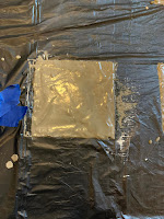
I bought home a box of cement and tried to make a concrete box myself. I used a plastic bag to keep everything clean at home. In the beginning, I was trying to free hand spread the cement into a square shape using a chopstick. But then it turned out to be too thin and looked unrefined. Therefore, I thought of another way to make use of the limited materials at home to create a mould. It was impossible to create box mould, therefore I tried to cut out 4 foam boards and stuck the together to make a 15 x 15cm square. I then poured the cement solution into the square and let it dry for 12 hours. I used a plate and chopsticks to stabilise the mould to prevent cement from leaking out. The cement turned out to look really nice. 


However, it has to be in a specific thickness to avoid the box from breaking. And I realised that it wouldn’t look good to place a thin book inside a thick concrete box. Therefore, the idea of using a concrete box to hold the book is put aside. 

(SB1) CITY VS NUNNERY - CITY

After having the crit with Helena, I decided to add city images in to the content of my book to create a bigger contrast between the urban and the rural area. 

IMAGE MANIPULATION 


  • greyscale 
  • threshold 
  • contrast +30
Using the above settings/ filters, the city images gave a lot more suffocation vibe than the original ones. The thresholded images look so strong and harsh that when audience look at them, they would not feel comfortable. Plus, when the contrast is pulled up, the black and white part became more distinct to each other which made the images look more sharp and straight into the face when audiences look at it. 


COLOURS 

  • Greyscale, black and white
  • Red 
I used black and white for the images to emphasise on the suffocation feeling that the city gives. Black and white also looks dull and boring which is exactly how city life is. 

I chose red for the page number to make it really sharp. I was going to use white, but it blended into the background.  Therefore, red was chosen to increase the feeling of suffocation and disturbed. 

LAYOUT 


Concept: crowded, packed, tall buildings


Concept: narrow streets 


Concept: eroded all over the place, image running beyond the page to emphasise the limited land supply.


Concept: ‘chopstick’ residential buildings, thin, narrow and long 


Concept: packed repetitive, aerial view 


Concept: packed repetitive, eye level perspective 


Concept: showing how the grid of the typeface is made 

TYPEFACE 


A grid of the city is created and a typeface is made using the grid created. Each letter is formed 5x5 and the letters HKG was made to try out if the typeface fits well with the book. It turned out that the typeface did not work well with the layout design as the pages that I made were image based and it turned out really weird looking when the HKG was placed into the pages.

CITY IMAGES DID NOT WORK WITH THE TYEPSETTING


If city images is added into the content, there will be no where to place the images of the nunnery. I was stuck for so long on where to place the images and this was stressing me out. I tried placing the nunnery images in the middle of each page and it looks so bad. I hate how the book looks like and it has been like this for a few days which is stressing me out. Therefore, after thinking about this for a few days, I decided to abandon the idea of adding city images into the book, and go for the idea of making the book into a physical form of a city escape.