Showing posts with label OUGD503 Resubmission. Show all posts

Sunday, 19 July 2020

ADD ON IDEAS

CONCEPT 1


I found out this zine about nostalgia. The designer made use of image manipulation to create a really grainy effect to mimic old dusty vintage photographs. I think this is a really smart way to create an immediate effect among audience that this is something about the past. I tried mimicking the effect and it actually turns out to create a completely different vibe. It gives off a much vintage aesthetic and this could be a new concept for the photoshoot, making use of image manipulation to create that vintage effect to deliver the idea of past memories. 


CONCEPT 2
I also came up with a new idea on "old Hong Kong", being nostalgic of the old streets signs of Hong Kong. Street signs and neon signs are actually one of the most significant feature of Hong Kong. Most of these signs have its own unique typography on it. 
Most of these neon signs have been taken off from buildings due to safety issues. However, there are still some hanging on buildings in some old districts.  The fonts printed are all different and has their own style. I think using. these old Chinese typography as a new concept of the image manipulation of the photographs would also be interesting to deliver the idea of past memories. There are also a lot of local designers or magazines trying to make use of old typography to create the vintage aesthetics. 


I then tried to add some text onto the photographs to mimic old vintage designs. I also came up with the idea of making them into postcards. As postcards are used to keep memories and spread memories to people around, I think it would be an appropriate medium for the theme nostalgia and something that is related to a specific place. 

I also warped the words to create that flowing effect of memories, how it is not a physical and solid object. 


RESEARCH ON NOSTALGIA

VIDEOS 
https://www.youtube.com/watch?v=WiTgn5QH_HU 


  • Nostalgia was once considered an illness confined to specific groups of people.
  • was seen to be a negative mental state
  • intense yearning of home
  • anyone separated from their native place for a long time is vulnerable to nostalgia
  • mental condition similar to depression
  • difficulties letting go of childhood
  • longing to return
  • homesickness
  • general longing to the past
  • mindsets changed
  • does not generally put people into a negative mood
  • remember personally meaningful and rewarding experience
  • can boost psychological well being
  • help increase self esteem and social belonging
  • make them act more cheerfully
  • can restore well being
  • new marketing technique
  • helps us remember the value of life
  • and be confident and motivated to face challenges in the future

After watching this short TED video on YouTube, I discovered that nostalgia is not only about the present and the past, it is also about the future. I am amused that I did not know about this before the photoshoot... This could be a new concept for the photoshoot that talks about the future. As most of the final outcome is about how one is trapped in his past memories, and longing to go back, I can actually develop a series of photos that talks about how we can actually make use of the feeling of nostalgia to motivate ourselves and develop hope within us.

MY OWN OBSERVATION
I realised that it is very true that nostalgia can actually encourage people and trigger sense of motivation towards the future. Taking myself as an example, I used to live in a house in the countryside when I was small, I moved out to the city after 12 years living in that house. Even until now, I still thinks about that place very often and sort of associated the place with my childhood memories. This makes me want to develop my future career and earn more to actually buy the exact same house in the future. Although it might not work, it actually motivates me to work hard for my future.

Sometimes, when I hang with friends, we would also talk about the past memories of our generation, about different cartoons that we watch when we are young and we can talk about those for the whole day. This process of reminiscing the past actually makes people happy and create a sense of connection among each other. Sometimes, we even go to some old places in some old districts in Hong Kong to kind of have a little escape from the prosperous city. This also shows that people tend to make use of nostalgia to escape from their hectic life. It could be a quick review of old photos, or even a visit to old places.


INSTAGRAM
This also makes me think of the old cultural heritage of Hong Kong and also those that have already vanished due to the new world development. I have also discovered that there are a lot of Instagram accounts about the "old Hong Kong" and old places that we used to go when we were a kid. The prompt of these accounts are usually about nostalgia and how we can actually use social media to keep the memories and even spread it to new generations.
As seen in previous modules, I am really interested in Hong Kong culture. I think I can actually expand this module's concept of a person's nostalgia into a generation's nostalgia, where I can actually use some old features fo Hong Kong as the main element to deliver the message. Since I am staying in Hong Kong for the coming semester, I think this could be a really good opportunity for me to really think about how I can further develop the idea.

Saturday, 15 February 2020

OUGD503 EVALUATION

OUGD503 

This module has given me an opportunity to collaborate with my friends and people that I like as it requires a great amount of group work. Especially when it comes to producing a final outcome that is self-directed, and having friends around helping me out, the feeling of producing an outcome together that we all feel good about is really enjoyable. 

This is my first photoshoot and this idea have been in my mind for years. My housemates and close friends Chapman and Natalie are the photographers of the project, and I really enjoyed working with them as they assisted me with different aspects of the project especially technical issues.

I have been really eager to direct and produce something and I was grateful to do so via this project.  I used to think that being a creative director would be really fun as I will be in charge in producing something I like with the help of other artists. However, first time creative directing was not as easy as anticipated. I felt like I was asking them to do everything for me. I understand that creative directors are the ones who create ideas and have others to work it out for them and this is what creative directing is. I have been really wanting to be a creative director and this collaboration has definitely helped me to gain more experience and learning more about directing hands on. Although it might not be exactly what I expected, I am really glad that I can finally have the opportunity to do this. It has helped me realised that being a creative director needs a lot of professionalism and I hope to improve over time. I would really like to devote more time into directing work in the future. 

As the deadline of the module is after the Christmas holidays, I have been overwhelmed by it and got really stressed about going to classes. I get stressed very easily and I used to manage my stress by managing my time and divide tasks into manageable chunks and work them out within a given time frame. This way of managing my time and stress used to work really well in Year 1. However, due to personal reasons, my motivation and productivity have been going down lately and it has definitely affected my work progress. Therefore, I have been trying really hard to get myself motivated. I have been spending time with my friends as feel safe when I am around them and it has made me feel cheerful. However, hanging out with them has consumed my time and energy for working on my coursework.  I am struggling to strike a balance between spending time with friends which helps improve my mental health and being productive. I hope it will get better over time and my productivity will get back on track soon.

A BOOK ABOUT BOOKS

Book about books 

RESEARCH 
- a medium for recording information in the from of text and images, typically composed of many pages 

ancient times
- religious purpose only  
nowadays 
- entertainment 
- religious purposes 
- education 

what are the functions of a book? 
- provide reader information and new facts 
--> educate people, provide them knowledge 
- provide vibrant and descriptive vocabulary 
- for audience to enjoy and be entertained by words on the page 
--> entertaining typefaces? 
- sometimes hierarchical structures can enhance the feeling that the content gives off 
- with scientific proof, when people read, their minds and emotions take over their bodies 
--> hierarchy is really important to control their minds and feelings 

book elements 
- images 
- text 
- titles 
- page numbers 
- footnote 
- cover 
- body pages 
- hierarchy (designers' part when making book) 

Hierarchy in books 
 the arrangement or presentation of elements in a way that implies importance
influences the order in which the human eye perceives what it sees
human brain has innate organizing tendencies that “structure individual elements, shapes or forms into a coherent, organized whole.”
- When an element in a visual field disconnects from the ‘whole’ created by the brain's perceptual organization, it “stands out” to the viewer
--> highlighting importance 
color, size, alignment, and character.

what do they specifically do? 
1. reading patterns 
- from the top down and most cultures read from left to right.
Recent studies have shown that people first scan a page to get a sense of whether they are interested, before committing to read it. 
Scanning patterns tend to take one of two shapes, “F” and “Z


f-patterns 
apply to traditional, text-heavy pages like articles or blog posts
- readers scan down the left side of the page, they look for keywords in left-aligned headings or initial topic sentences, then stop reading when they come to something interesting 
- results look like an F


z-patterns 
apply to other sorts of pages, like ads or websites (block paragraphs) 
- first scan across the top of the page, then shoots down to the opposite corner at a diagonal and does the same thing across the lower part of the page


2. size matters 
- people read bigger things first 
this tendency is strong enough to override the top-down rule

3. space and texture 
give content ample room to breathe to draw attention 
- substantial negative space left around an element --> more readily visible to readers 

overall arrangement or pattern of space, text and other detail on a page
- balance in positive and negative space 


What if there is NO visual hierarchy?! 
cause confusion 
- readers take in all info at the same level of importance 
- make audience confused and not able to digest much or any information 
- they bounce round all of the "parts" without ever getting the "whole" 

After doing research and reading articles about books, I realised the importance of hierarchy in books and that without hierarchal structures, a book would be useless, and will not even be considered as a book. I thought that it would be really interesting to talk about the relationship between hierarchy and content, designers and writers. Both of them has to work together to create a book that is "real". Therefore, I decided to produce a zine based on the idea of the importance of hierarchy by using simple InDesign elements, text boxes, image boxes and of course, the most important elements on a book, text and images. 

concepts 

  • content and hierarchy 
  • without content, hierarchy is nothing 
  • without layout, content is nothing 
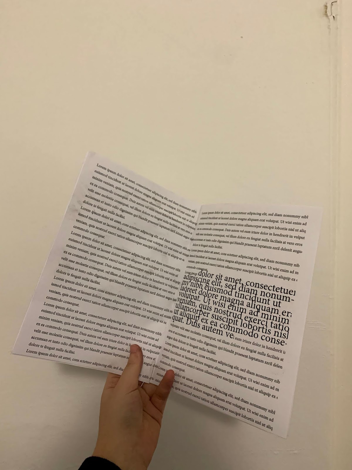
MY INITIAL ATTEMPT
Books are bounded pages with contents that are well designed and placed under a set layout. This book is showing the importance of the hierarchy of content and that a book will only work and be legible to readers only when words and images are placed under a hierarchal structure. Conversely, when only text and image boxes are placed in a page without any content, it will not be a "book". 


I then sent the file to Han and she did some changes and tried to enhance and decorate the pages. She added images and made the words into different sizes. This is to show how messy it would look lie without any layouts in a book. Han's idea was a bit different from my initial one, emphasising on how a book would not be looking like a book when there are only text boxes. However, turned out that her outcome looks quite interesting and is actually really hard to read too. 


FINAL OUTCOME 
printed the zine out and I really like the outcome as the messiness and randomness of how text and images are placed without any designed layouts look really nice together. 


Due to personal issues, we did the project separately in our homes. This definitely affected our communication as we only texted through messages. 


Thursday, 13 February 2020

[COLLAB2] FINAL RATIONALE

RATIONALE
A collaboration of 4 art & design students. Two photographers, one illustrator and one graphic designer. 

Nostalgia is the theme of the photoshoot. It is an overwhelming feeling mixed with emptiness and sadness. Being nostalgic means that you are in reminiscence of the past and are longing for the past. The past could be something that is safe and makes you feel secure and comfortable. It could be a person, an event, or simply just a place. 

In order to convey the idea of the nature of memories. The theme white on white is used in the photoshoot. It is to increase the feeling of spaciousness and emphasise on the emptiness that it gives off. In order to keep the pictures minimal, a red rope is the only prop of the photoshoot. It is the physical from of memories and can also be interpreted as blood. 

The expressions of the model are divided into two concepts, a negative one and a positive one. Some of them explains the feeling of emptiness and sadness due to the fact that we cannot travel back time, and the only thing we could do is to keep on think of it and do nothing about it.  Some reflects the happiness and secured feeling when reminiscing our memories, staying in the comfort zone that is built up by past times.

As for the texture of the background, it is grainy and glitchy. It communicates the ideas of memories leaking out when a person is being nostalgic, as well as the nature of memories, constantly fading away. 

A website is made to showcase the final outcome fo the photoshoot. 
It is an online exhibition themed “nostalgia”. When you press on the “click” button, the image is going to refresh and a new image will fade in, like the nature of memories, constantly fading in and fading away. At the top right corner, there is a “memories” button when you click it, you will we brought to a new tab, like small pieces of fragmented memories. There is no “home” button for audience to go back, this is to convey the idea of nostalgia, the feeling of longing for the past, but reality does not allow.


Wednesday, 12 February 2020

[COLLAB2] FINAL OUTCOME

Colour adjustments 
  • adjusting the luminance and saturation of the red 
  • Making the red pops up more 
  • With the big contrast between the white and the red, audience would be more focused on the red rope, which is the main element of the project 


FINAL ONLINE EXHIBITION
page1

page2
https://kcmmman.github.io/nostalgia1/memoriespage.html