Monday, 11 May 2020

CARDS FURTHER DEVELOPMENT

Applied the idea of the poster task on image manipulation 
Step 1. cropped graphic parts of satan paintings 


Step 2. stretched them 


OPTION 1
desaturate to make it less distracting? 
  • people will have no idea what the image are
  • if so, what is the point of the image manipulation when audience will never understand the idea behind? 


OPTION 2
coloured version, look less dull 
  • will it distract audience? 
  • or is it successful in creating the sense of discomfort? 


front and back background colours 
  • bnw vs pinknblue
  • pinknblue is kind of distracting 
  • how to further arouse curiosity among players? 


FINAL DECISION 
  • used pink to blue gradient for the back
  • black and white for the front 

This is to match the box packaging idea, black and white on the front and pink and blue on the back. Using colours on the back of the cards can create curiosity among other users, who are not able to look at the front of the card. Making them surprised about the contrast when they know about the content written on the front. 

Sunday, 10 May 2020

CARDS INITAL DEV

I created 3 different variations based on the same idea. I personally like the left one and the middle one. The right one looks like ADIDAS campaigns to me. I will probably save that for later, maybe for the making of GIFs to present the outcome? with the word DARK glitching in different colours?  

I made two versions with the black and white swapped. I then showed the two designs to my friends and asked them to tell me what was the first word they saw when they first looked at the design. They saw DARK first for the left one and You first for the right one. After showing them to friends, the conclusion is that the hierarchy and the colour combination of the left one makes audience focus on the word DARK more. Therefore, I decided to go for the left design, with the word DARK in black. I am thinking of making an animation of the white words collapsing, while the DARK remains still, to further present the idea. 

I created a gradient of blue and pink for the background of the cards. The gradient with no texture was created. I thought that it was too flat and therefore I added some grain onto the gradient to make it less dull and lame. The result on the left would be used as the final background colour of the cards. This is to create a dreamy and peaceful feeling among users when they first look at the cards. The moment when they begin to read the text and the content, they will realise that it is exactly opposite from the soft and bright colours. 

I made some mockups of the deck and the box. For the first attempt, I use black with no gradient for the sides of the box, however, it looked a bit of of place when I put a solid colour next to a gradient. Therefore, I made a gradient of black to oink for the sides fo the box. 

1st attempt


The gradient of the sides could be justified as the dark engulfing the pink. Pink represents the good side of humanity and the black represent the dark side. As for the back of the box, I might add a short description with the blue to pink gradient as bg colour. This can create a big contrast using colours on the packaging and arouse curiosity among audience.  

2nd attempt 

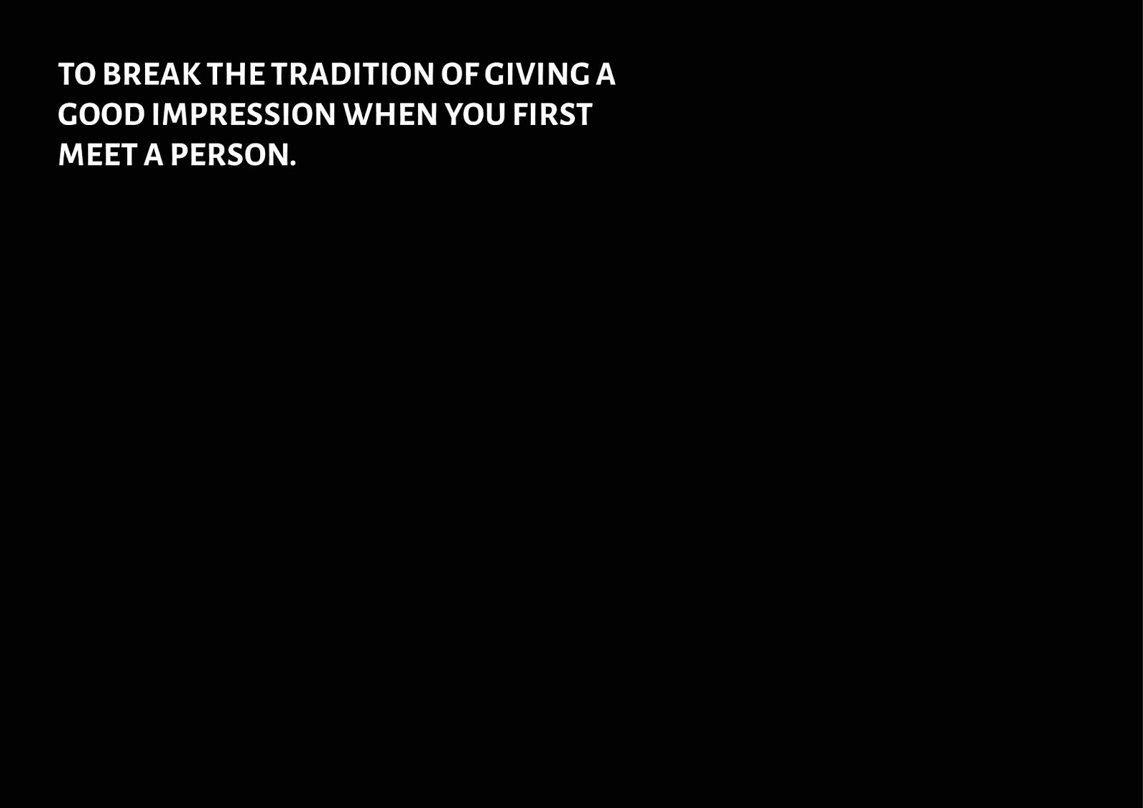
I then further developed the cover design. I made the S hanging on the line to make the design more eye catching. I think this idea will look good if it is made into an animation with the black words collapsing, the DARK staying still in place, and the S hanging on the line when it collapses. I time allows, I will make this animation idea to present the outcome and strengthen the branding of the product. 

Friday, 8 May 2020

[RESEARCH] PRIMARY RESEARCH (INTERVIEW)

In order to get some feedback and comments, I asked friends if they would be interested in buying if there were a set of cards (use in drinking parties, icebreaking) that is for getting to know the dark personality traits of others. The following are the results:

  • might not be sober enough to play
  • interesting idea, something that I would like to try 
  • will only play with close friends, but not acquaintance 
  • would be even more interesting if playing with people that I am not familiar with, or new friends. Everyone would be curious in knowing the dark side of each other, it is a new way of icebreaking
  • I think its quite embarrassing if I play it with friends that I am not that close with, people wouldn't want to reveal "good impressions"
  • would be more exciting and fun if you cross the line when playing drinking games
  • the drinking environment, like bars, are usually somewhere for relaxing with, with alcohol, people would be more open 
  • Can we play it in Skype? online parties? 
  • Cards Against Humanity plays around he idea of absurdity instead of really testing something against humanity. It is just some random questions and the one with the funniest random answer wins. It has nothing to do with personality dark traits. Your idea would be a "real cards against humanity" 

MY THOUGHTS
The discussion drew usually surrounding the idea of whether it is suitable to play with acquaintance. Some might think that it is crossing the line as they would not like to reveal that dark side to people they don't know. Some thinks that it would be a fun ice breaking game for knowing more about each other's dark side, instead of like the traditional way, always. introducing a "good impression" to others when you first meet a person. I think that it is audience's choices whether or not they would play with acquaintance or strangers. From the feedback, all of them are willing and are interesting to play the cards with close friends. So this is already something that can attract audience to purchase. It is theirs to choose in how to use the cards after buying. For me, I do not mind playing the cards with strangers. I will have to come up with a more completed set of rules into how to use the cards. Is it necessary to limit it become a drinking game? will the target audience be narrowed down and affect the sales? 

[RESEARCH] CARDS AGAINST HUMANITY


DESCRIPTION
Cards Against Humanity is a party game for horrible people. Unlike most of the party games you've played before, Cards Against Humanity is as despicable and awkward as you and your friends.
RULES
The game is simple. Each round, one player asks a question from a black card, and everyone else answers with their funniest white card.

This existing deck named CARDS AGAINST HUMANITY used a very interesting branding method. The name undoubtedly is very interesting to me. I would want to purchase it by only looking at the package. It arouses curiosity by not revealing too cut content. In their website, they used a funny way to express their words. They included cuss words in their instructions and this way of branding and presenting is exactly opposite form what I expected when I look at the cover and the package. 

Friends told me that they have played it before in drinking occasions. They enjoyed the playing process, but felt a bit confused when they look at the package. I then watched youtube videos of people playing this set of cards. They played it with alcohol and they definitely had fun. However, I personally think that the package creates confusion like what my friends said. I understand that this is their way of branding, making the package look serious and when you open it and actually play it, it is actually funny. This. way of creating a contrast is so interesting that I think it could be applicable to my design. Instead of using text to create the contrast, I could maybe make use of colours, bnw and bright. colours to create. that sense of curiosity and confusion? 

[VISUAL RESEARCH] PLAY CARDS

I did research on some existing play cards. I found out that there are many different styles and the styles tend to provide a better experience for their particular target audience. Designers make good use of colours and shapes and the style of illustrations to create the best combination of hierarchy. They branded different sets of play cards with the best aesthetic that suits the usage and functions of the deck. Some targets children, some targets young people, some are suitable for everyone to use. I realised that no matter how different the styles are, they will never affect the functions of the cards and will never distract the content with their designs. This is a really important point to think of when I design my set of cards. I should not overuse decorative elements and distract audience from reading the text on each card. 

*bold italic-ed points are the ones I think is suitable and applicable for my design outcome*

MINIMAL
  • user- friendly trend 
  • Clarity
  • Expressive visual hierarchy
  • High attention to proportions and composition
  • Functionality of every element
  • Big amount of spare space
  • High attention ratio to core details
  • Typography as a significant design element
  • Eliminating non-functional decorative elements
  • simplicity
  • flat design 


1.


2. 
  • shapes and lines
  • white and red 
  • maximum 2 colours 
  • thin fonts
  • good use of white space to create hierarchy 


CLEAN [TAROT]

  • no colour
  • serif font to make it look less modern 


ILLSUTRATIVE
1.

  • hand drawn illustrations 
  • bright colours 
  • no words, text 
  • use only drawings to show meaning 
  • childish, kid-like


 2.

  • tbh I love this style so muchhhhh
  • simple illustrations 
  • using the theme of myths and bedtime stories 
  • large variety of colours used, but. still of the same colour tone to create consistency 
  • hand written words to fit the theme and the drawings 


GEOMETRIC
1.

  • only yellow and blue, but with different shades to make it less dull and flat
  • boxy fonts to fit the geometric style 
  • good use of white to lessen down the colours, make it cleaner 


2. [TAROT]

  • gradient makes it look modern and stylish 
  • add depth to design 
  • used white to section text 


BOLD AND STRAIGHT FORWARD
1.

  • crowded text 
  • simple colours as background (primary colours?) 
  • simple illustration to describe the content 
  • good use of colour contrast, bnw vs bright colours 
  • used black only on the outer package, bright colours no the inside (surprising) 


2. 
  • love the typography and how text are placed in a overwhelming way 
  • bold and strong 
  • contrast between front and back of a card (surprising) 
  • big contrast on colours used in front and back of each card
  • creates a different emotion among the player who is holding the card and other players who can only see the back of the card 
  • arouse curiosity 


REAL IMAGES/ PHOTOS
1. [TAROT]

  • good quality photoshoot 
  • would like to try this so bad, but time won't allow and I will need to rent a studio for the photoshoot
  • only one colour tone on one card 
  • photo speaks itself  
  • with few words to describe the content 


2. [TAROT]

  • photo collage 
  • yellow and blue only to add depth 
  • desaturated photographs