Thursday, 28 February 2019

6 IDEAS

write down any themes occurring in your project 
make links and connections 

overlaying different maps 
abstract maps 
rndrd.com @rndrd 

photographing things in the exact same angle, spot the differences 
overlay them 
typology 
bernt pillar becmar  
research: socks studio 

create a map of _______ by using only ________. 
1. a map of trees, by using only colours.
2. a map of buildings, by using only close crops of images. 
3. a map of buildings, by using only textures
4. a map of buildings, by using only memories. 
5. a map of comparisons, by using urban and rural images 
6. a map of eggs, by using .

some more ideas:
- documenting the handwrittings of notes in class
--> beginning: neat n tidy
--> after a while: starting to get wobly
--> nearly the end of class: messy, hard to read
--> lesson ends: gave up writing notes

planner:
- write down everything i did in a day
- look at the differences and similarities
--> create a map of things that i do everyday (everyday routine)

flowers:
- buy flowers from market
- photograph the flowers everyday to see its growth until it withers
- create a colour palette of the flowers (first bought--> dies)
- document textures of the petals everyday

sounds:
- record sounds outside where i live everyday at 12-1am
- monday: more quite (short conversations of ppl)
- friday n sat: nosiest (ppl screaming n yelling)

staircases:
- photograph staircases from everywhere
- how many steps r there?

graffiti:
- photograph all the graffits i saw on streets
-->

imagining myself as a bird vs an ant:
- bird: (ref to google earth, shapes of rooftops)
--> aerial view (looking down from above the sky)
--> minimizing everything (rooftops)
- ant: height of buildings
--> magnifying everything (height, textures)
--> looking up from the ground

inverting the earth map
- land into sea
- sea into land

Monday, 25 February 2019

TEXT N IMAGE ONLY IDEAS

scratching paper —> scratch them on the actual image 
the image will be revealed but by but as you scratch 

text only (collaged typography) 
image only 

ideas: 
  • coordinates 
  • crop the photos —> hv people hold them up to find the place 
  • interactions of people 
  • drawings overlaying on images 

leeds arts 
53.8088° N, 1.5516° W

parkinson building (leeds uni) 
53° 48' 33.768'' N 1° 33' 12.888'' W

laid law library 
53.8069° N, 1.5515° W

church club 
53° 48' 25.38'' N 1° 33' 5.076'' W

unipol 
53° 48' 21.132'' N 1° 32' 58.164'' W

dry dock
53° 48' 33.768'' N
1° 33' 12.888'' W

leeds beckett 
53° 48' 12.1644'' N 1° 32' 53.376'' W

merrion house
53° 48' 9.036'' N 1° 32' 37.284'' W

morrisons 
53.8023° N, 1.5451° W

walkabout
53° 48' 33.768'' N 1° 33' 12.888'' W

chatime 
53° 48' 16.596'' N 1° 32' 50.46'' W

things that you saw along the way —> draw them out based on memories —> put drawings on images 
—> animated 
—> drawings of people 
—> ghost of memories 

complete the cropped images of buildings based on your memories 

patterns of places 

put acétate on screens 
recall what they say in videos 
list of colours
list of what they wear 
colour palettes of people’s clothes 
—> colour squares
—> like its pixelated 
—> abstract videos 

every 10 frames 
—> action effect in photoshop
—> colour changing bars 

—> convert videos into image frames 

TASK 
text only 

image only


variations:
adding instructions to make it easier to understand 


using textures/ patterns of buildings 

Did some sketches of signage and buildings along the way to Morrisons. The sketches were being overlayed onto the actual images of those buildings. 


sketches could be added to the text only design to make it more interesting. 

OUGD406 MODULE BRIEF

25 FEB 2019
design practice 1

  • by the end of the week —> 3 maps idea
  • tue —> half day 
  • thurs, fri —> split 
  • 6 weeks, break up for easter on 5APR
  • holiday starts on 16 MAY 

TASK
  • professionally produced final outcome —> design boards 
  • any format, production method 
  • displayed at the end of year exhibition 
  • MAKE 3 MAPS BY THE END OF THE WEEK 
  • crit on monday + make it physically + development, experimentation on sketchbook
  • then develop 

  • (SB2) brand identity for exhibition —> design boards

submission
  • blog everything
  • a printed map (A0/ folded/ compressed/ binded)
  • 6 design boards 
  • sketchbook 

WHAT IS A MAP?
  • diagrammatic representation of physical feature: cities, roads
  • a street map

PRESENTATION
  • challenge the idea of what a map is
  • Hours May Vary (mapping exhibition 5th-11th apr) 
  • app: STRAVA
  • film: 

How would you challenge the idea of what a map?
what tools will u use to map your route?
mapping a place? a conversation? the wind? the fog? something mundane? make a piece of music out of a map? sth physical? emotions? people? type in LEEDS? 
something really focused 
drain cover? windows? experience-based 
a soundtrack/ video to go with your map? 
smells? 

how do you present the info?
  • printed map
  • packaged
  • vinyl stickers?
  • how you use symbols? 
  • documenting sth?
  • leaving sth behind that environment?
  • interactive map?
  • recreate/ remap historical events?
  • colour wall? capture everything in blue? 
  • ref: CHRIS KENNY, Neida Sa
  • ref: situations international (1957)
  • how do you engage with the environment in a diff way


FINAL: MONDAY 1ST APRIL

WHAT TO DO TODAY

  • divide into 2 pairs
  • walk in different directions 
  • phone the other pairs 
  • 10 min walk in one direction 
  • turn your way back following the same route 
  • one person photographs
  • one person draws 

Thursday, 21 February 2019

FINALIZED POSTERS

text and image
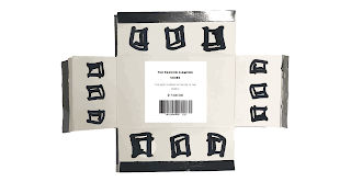
Windows were drawn onto the stacked shoe boxes to create a feeling of claustrophobia. They are to portray the closely built and concentrated housings in Hong Kong. As there is a housing shortage, housings are becoming so expensive that they are not affordable for all citizens. Shoe boxes were used as people nowadays love to collect expensive shoes and sneakers. They reflect the overpriced housings in Hong Kong. A price label of an unreasonably overpriced shoe was place in the centre to further strengthen the overpriced concept. 

 image only
There are pictures of the sky being cropped by cramped buildings on the internet. The images were took in the perspective of looking up vertically from the ground. The shape of the cropped sky was used to overlay a picture of cramped buildings on it. The design reflects the limited space of Hong Kong and creates a feeling of sympathy when audiences imagine people living in such tiny spaces. Buildings are being cramped in this small piece of land and what people see is just this cropped piece of the horizon, feeling like they are trapped. 

text only
The chinese characters are the names of furnitures that are necessary for a home. The use of closely packed kernings produces a feeling of suppression which aids the communication of a cramped space. Black was used for the whole poster to strengthen the uncomfortable feeling of suppression. It looks as if the black is suppressing the chinese characters into a tiny square.

mockups


Wednesday, 20 February 2019

SHOE BOX NET IDEA DEVELOPMENT


I did two variation:
1. price label in the centre
2. price label on the side flap

1. looks visually more eye catching as the label is right in the middle. It attracts audiences' attention and makes people focus on the content of the label. 

image traced the photo to make it look more digital to match with the price label.

before:


after:


Tuesday, 19 February 2019

FINAL CRIT ON POSTERS


The silent crit today was different. We were told to not look at the descriptions of others posters and see if we could get the theme of the posters. This way of doing the silent crit allowed us to strengthen our visual communication skills as we will have to use simple, yet strong visual elements to convey the idea behind.

1. TEXT ONLY


- words need to be smaller with closer kernings to show the overcrowding 
- creates a feeling of claustrophobia --> feeling of discomfort 
- black is good to reverse this idea of cramped and turns this into the negative spaces 
- design 1 --> strongest idea, uses chinese type to represent hong kong, confined to a square to show the limited space
- try without a border

2. IMAGE ONLY
- like the buildings perspective, to showcase the full scale and depth of housing, and how small we are compared to that 
- a bit too abstract, not too sure on the message and what its trying to convey 
- having buildings as the main element highlights this theme
- try to edit the image darker to create more darker tones 
- idea is good but too abstract, try using a different way to present the idea

3. TEXT AND IMAGE

- unsure on the shoe idea - don't understand, grabs interest 
- suggested that the houses are like shoe boxes, too small and cramped 
- text and images worked well 
- the repetition of items shows this cramped element 
- not too obvious in the way it is presented, liked the boxes how there are accumulated 
-showing that houses looks like stacked shoes--> everyone is on top of each other
- make the labels smaller to make them look more like it was on the shoe box (bottom half)

FEEDBACK
sympathy:
- couldn't how people are living in these crowded spaces and poor living conditions 
- makes me feel bad 


Ben's suggestions

I was stuck and had no idea on what to do with the image and text poster. People liked the shoe box idea, but they looked not refined, also, there are no text on the design. I chatted with Ben and he suggested to to use a real shoe box, draw windows on it and edit until there are tonnes of them stacked. However, I need text on it and this leads to another idea of using the net of the box. I could draw windows on the flaps and place the shoe label on one flap. I decided to develop this idea in order to copy the message clearer. 

CHANGES MADE AFTER THE CRIT
1.
I edited out the square and made the words more closely packed.

2.
I edited the image of the buildings and made the contrast higher. It turned out with some darker tones and the patch became more stand out. 

3.
I combined the two ideas and placed the label on the shoe boxes design. 


I will be trying out the shoe box idea later today or tomorrow. If the outcome was appealing, it will be the final outcome of the text and image poster. Otherwise, it will be one of the initial ideas.


Sunday, 17 February 2019

FINAL POSTERS FOR FINAL CRIT

HOUSING SHORTAGE IN HONG KONG 
The housing shortage problem does not only lead to the concentration of people in limited living spaces, but also the closely packed patterns of housing estates. 

TEXT ONLY
Housing shortage is really serious in Hong Kong and people are cramping in small flats that are being sub-divided into small rooms. The rooms are so small that the furnitures are needed to squeeze into rooms. This is the concept of my TEXT ONLY poster. The chinese characters are different furniture names and they were being squeezed into a small box with represents the sub-divided rooms that people live in. Parts of the words are being cropped by the box to show that there are actually not enough space for them to be placed. Black is used as the background and the box is in white to create the feeling of the black encroaching the box and the white space is being suppressed by the black. 


IMAGE ONLY
Due to the imbalance between the population and the living spaces, housing estates are being built in a concentrated way that buildings are closely packed together in the limited space in Hong Kong. The buildings are so packed that the sky is being cropped by the buildings. There are tonnes of pictures in the internet of people shooting from the ground and vertically up to the sky, the sky is being cropped and left only a small piece of cropped sky. This is what Hong Kong people see every day, being crowded into a small space, looking at a cropped sky. The IMAGE ONLY poster is inspired by this fact and that the horizon that Hong Kong people see is only limited in that cropped area. 


TEXT AND IMAGE
Hong Kong is listed as having the most expensive housing market in the world. As there are not enough housings for all citizens, the prices of housings began to rise because of speculation and it leads to a a secondary problem -- overpriced housings. I myself as a Hong Kong citizen can experience the financial pressure that housing prices have given to families. Housings have become like luxuries that not everyone is affordable. This leads to the concept of the IMAGE AND TEXT poster. People nowadays love to sneakers, however, most of them are so expensive that not everyone of them could afford the high price. This is exactly like what is happening in Hong Kong. People need places to live, but they are too expensive that many people couldn't afford them.