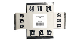
I did two variation:
1. price label in the centre
2. price label on the side flap
1. looks visually more eye catching as the label is right in the middle. It attracts audiences' attention and makes people focus on the content of the label.
image traced the photo to make it look more digital to match with the price label.
before:
after:


No comments:
Post a Comment