Thursday, 28 November 2019

(SB2) UPLOADING TO GITHUB

After looking at the brief on estudio, I saw GitHub is on the reference page and it is actually a website for structuring my website that is suggested by the tutors. It is really useful for me as this is the first time I code and I did not know where I can actually make my website into a real one that is interactive. 

I uploaded the coding sheet onto GitHub. It did not work at the first place and I tried it again, uploading it page by page and at last it worked. 

It has become a real website. Users' can now insert the website address into their domain and that they can now interact with my design. 

https://kcmmman.github.io/standwithhk/ 


(SB1) FINAL OUTCOME MAKING

I printed two copies of the concertina.

For the first copy, I tried using the creaser in the digital print room, it did not work properly as the creases were too thick and the creaser in the print room is slightly offset. Therefore, I decided to try put it aside and try folding the pages on another copy.


For the second copy, I tried scoring the pages with a cutter. it kind of worked, turned out really clean, but still not perfect.

I then stuck the pages together with the tabs overlapping the third pages, I tried to align the words and it was quite successful.
On the other hand, the final product did not turn out looking like a concertina at all. All of the pages were shifted to the left.

I was so disappointed. I spent so much time worrying about the printing outcome and tried my best to fix the document and get prepared for printing. But then it still did not turn out perfectly. The 'concertina' did not even fit into the box and everything failed.

CONCLUSION
- when alignments of the text are accurate, the pages are shifted.
- when pages are aligned well, the alignments are shifted.

FINAL EXECUTION
As this brief emphasises on the production method, I decided to give up the content accuracy.


I therefore decided to in order make the book at least looks like a concertina, I gave up the alignments of text. I used the first copy (which is being creased not properly) and tried making it again, despite all the wrongly creased marks. It then turned out to finally looking like concertina, however, the users will not be able to read the text properly. It can then finally be placed inside the box properly.


Wednesday, 27 November 2019

END OF MODULE EVALUATION

In terms of my practical work, I think that making a book is really time consuming. Everything has to be set up accurately for the printing part and I know that I am not familiar enough with the preparation process. I will have to practise more and try making more designs for print in the future to get prepared for my future career. 

Compared to last year, I am actually really disappointed with my time management skills. Last year, managing time well and planning out everything was my way of distressing. I used to write down my schedule everything and a to-do-list every week to keep my work on track. However, I tend to be less strict to myself. Maybe due to the fact that I was stuck with my ideas, I tend to procrastinate and deal with everything at the last minute. 

Hopefully, I would be able to improve my time management skills and do what did I last year, planning everything out. For the next brief, I aim to be hard working as last year and finish off everything at least tow days before the deadline. 


Also, I feel like I have been to shy. I am just too scared to ask people for help. However, I realised that actually if I try to tell people my issue that I am dealing with, people will actually help me and give me useful advice. There is no need for me to be afraid of asking as tutors, technicians, professors are here in uni to help us and give us advice for us to improve. Therefore, I really hope that I can be more daring to talk to people and ask people for help. 

(SB2) BOX TEMPLATE (PRINT)

As I do not want the book to look like a sandwich, I decided to make a box template for tomorrows printing session. The box to going to hold the publication. 

1ST ATTEMPT
2ND ATTEMPT


(SB1) FINAL PREP FOR PRINTING

The printing process is definitely not the best choice. I knew that the digital printing service from our uni does not support printing a 13 A5 pages concertina. I was going to buy a long piece of paper myself fro printing my publication out in the right size so that I wouldn’t have to cut it into half and sticking them together. However, I realised that even if I got the long paper, they also don’t support printing the concertina because the maximum length that they could print is 1.3m which is shorter than my whole book. I also tried to look at printing companies if they could print a long concertina, most of them only do mass production and the prices are out of my budget. I even tried asking my Leeds Uni design friends if they could give a hand, it ended up not successful as they also do not support printing a long concertina. 

On the printing day, as James was not in, I told Steve about the problem I am having and he offered help. He asked me to go meet him the dayafter at the comuputer resource room and we can get it sorted together. He also helped me to book digital print again so that I can print the final outcome before the dealine. I am actually so thankful that he was being so nicely and helpful. Steve showed me the best possible way to make the concertina and it was so complicated. 

I then came in to find Steve today to get the printing document sorted. We figured it out at the Mac suites and it was so mind blowing for me. Steve suggested the best possible way to recreate the document. He created a SRA3 and tried putting a few pages of my concertina on to see how many pages can it actually fit in. It turned out, after adding the bleed, it can only fit in two pages on each SRA3 paper.

He then created two A-masters. One for the fronts and one for the backs. For the front pages, he added a tab on the right spread and for the back pages, he attached it on the left spread. The tabs are going to be used to stick it to the next page so that the glue or the glue or the tape will not be visible. However, as the tab is going to be overlapping the front pages, we have to actually use a tiny part of the next page as the tab so that it will not be covering up the words on the next page. This part is actually so complicated to make as we have to measure the bleed as well. 

In the end, we nailed it. The document is print-ready for tomorrow. 


Monday, 25 November 2019

(SB2) FURTHER DEVELOPMENT

umbrella --> signature of protesters 
protesting = processing= loading --> ongoing event, movement  
13 frames of letters 
umbrella stopped rotating as it won't lies at the same place as the beginning if there is 13 frames for the umbrella 


blue background 
different news about the Hong Kong protests 
international news 
text --> a short summary of the ongoing protest
upper right corner has the umbrella logo rotating to maintain consistency 
red to yellow after clicking into the link 
yellow represents the protesters' side 


meant to be blue, changed it into green to represent green object 
meant to be using angry faces, however I realised that it is not true 
sarcasm smiley faces to represent police when they were firing bullets at the protesters 
smiley faces popping out one by one = robots, all the same, manipulated police 
FUCK THE POPO = speaking out fro majority of Hong Kong citizens 
= way of venting the rage among Hong Kong citizens 


tear gas looping, repeating 
Hong Kong police force had fired more than 9000 rounds of tear gas since June. 


exploded tear gas 
summarising the whole protest with tear gas pictures and protesters fighting back 


the last page is linked to the "Condemn HK Police for Excessive Force against Citizens & Call for Independent Inquiry" poll which encourages people to vote for Hong Kong protesters 


(SB2) PRACTICAL RESEARCH

CODING 
Three different coding methods 


  1. Html
  • Structure content (text and images display) 
  • base of the website (building block) 

  1. Css (style sheet) 
  • adding colour cascading style sheet
  • Text styles, table sizes, colours, padding around images  
  • Basically controlling the style

  1. Java script 
  • make it interactive to the audience 

PROCESS
<!DOCTYPE html> —> to signal your document 
<html> —> start 
</html> —> end 
<head> 
<body> 
<h1> —> heading 
<p> —> paragraph 
<div> —> divide 
<pre> —> make your own typesetting 
<a> —> link 

AFTER EFFECTS (GIF MAKING) 

Basics learnt from After Effects workshop 

  • Keyframes 
  • Change speed and directions 
  • Rotate 

Sunday, 24 November 2019

(SB2) CONTEXTUAL RESEARCH

 EXISTING NAVIGATION APP  


  • The app is designed for a broad audience. 

GOALS:
    • Exploration tool that helps users learn about things happening nearby 
    • Allow users to create their own events
    • Provide convenient and friendly application behaviour
    • Allow users to create and configure areas on the map to prioritise events that are interesting to them specifically 

MT THOUGHTS 
  • This is actually my first time looking at UX/UI designs. I realised that most of them are very user friendly which they tried to put themselves into users’ shoes in order to create a design which provides the best users’ experience. In order to achieve this, they tend to focus on the usability of the app and make the app easy to use, with simple and obvious buttons. 
  • Many of the apps also applied some elements to make the app applicable to each different users. This way of personalising each download from different users is really smart. They can also create a community of their users and update their app based on the data collected form the users’ behaviour. 
NET ART ANTHOLOGY


AESTHETIC 
  • aims to address the shortage of historical perspectives on a field in which even the most prominent artworks are often inaccessible
  • The website showcases a lot of different net art sites created by different artists, they put up random stuff on the sites using the net art aesthetic 
ELEMENTS 

  • GIFs
  • The background changes colour when I hover my mouse around 
  • Underlined titles 

MY THOUGHTS 
  • I would really want to try out this style for brief2. I realised that they use a lot of GIFs when creating net art. GIF would be a really good element for my website as it represents the idea of looping. 
  • In the past, net art did not even exist. They are normal websites that people used to provide information online. However, nowadays, it became a particular design style which is old-school and strongly aesthetic based. People are trying to imitate the style and trying to convert different contemporary designs into the from of net art. I think that this would be a really good way to link to the theme of nostalgia, using an old school way to communicate a contemporary idea or an ongoing event. This way of communication through the aesthetic make audiences reminisce about the past, which I thought would be applicable to my project. 

HISTORY OF NET ART

  • Net art is an elusive and sometimes anarchic art form which uses the Internet as its primary material. Net art works often draw on data from other Internet materials and websites, which helps give them their distinctive dynamics and transience.
  • historical term for early net art, which can be dated to having run roughly from 1993/94 to the early 00s.
  • We can recognise a clear code aesthetic, where the use of faults, or so-called ‘glitches’, act as a methodical conceit in net art.
  • That net art can be linked to physical space, some create works that activated both physical and digital online space in a process where one supported the other.
  • e.g. Antonio Muntada’s The File Room (1994) 
  • temporary physical installation and an open-ended online database that contain records of past cases of censorship around the world.


SEE PALA

(SB2) CONCEPTUAL RESEARCH

HONG KONG'S ANTI-EXTRADITION PROTEST
The situation right now in Hong Kong is worse than you can ever imagined. I have been looking at news and keeping in track of what is happening in Hong Kong. Seeing my hometown being destroyed by its own people is just so depressing and wrathful.
BACKGROUND 
The Extradition Bill
The bill will path a way for unjust and dubious treatment of people in Hong Kong. Anyone can be arrested and brought to trial by the Chinese government. Unlike the Basic Law and the still-standing judiciary in Hong Kong, the Chinese judicial system lacks independence and recognition of human rights. The arrested are under no protection and could be subject to unfair trial and mistreatment under China’s judicial system.

Article from BBC


The extradition bill which triggered the first protest was introduced in April. It would have allowed for criminal suspects to be extradited to mainland China under certain circumstances.
Opponents said this risked exposing Hong Kongers to unfair trials and violent treatment. They also argued the bill would give China greater influence over Hong Kong and could be used to target activists and journalists.
Hundreds of thousands of people took to the streets. After weeks of protests, leader Carrie Lam eventually said the bill would be suspended indefinitely.
How did the protests escalate?
Protesters feared the bill could be revived, so demonstrations continued, calling for it to be withdrawn completely.
By then clashes between police and protesters had become more frequent and violent.
In July, protesters stormed parliament, defacing parts of it. In August, one protester was injured in the eye, leading to demonstrators wearing red-coloured eye patches to show their solidarity.
Protest action at Hong Kong international airport in August also saw renewed clashes and led to hundreds of flights being cancelled.
In September, the bill was finally withdrawn, but protesters said this was "too little, too late".
Demonstrations continued, marked by an increasing level of violence.
On 1 October, while China was celebrating 70 years of Communist Party rule, Hong Kong experienced one of its most "violent and chaotic days".
An 18-year-old was shot in the chest with a live bullet as protesters fought officers with poles, petrol bombs and other projectiles.
The government in response banned protesters wearing face masks - a ban that many activists continue to defy.
In early November, a pro-Beijing lawmaker was stabbed in the street by a man pretending to be a supporter.
One week later, a policeman shot one protester at close range when activists were trying to set up a road block and later that day another man was set on fire by anti-government protesters. Both had to be treated in hospital.
What do the protesters want?
Some protesters have adopted the motto: "Five demands, not one less!" These are:
  • For the protests not to be characterised as a "riot"
  • Amnesty for arrested protesters
  • An independent inquiry into alleged police brutality
  • Implementation of complete universal suffrage
The fifth demand, the withdrawal of the bill, has already been met.
Some also want the resignation of Carrie Lam, whom they view as Beijing's puppet.
Protests supporting the Hong Kong movement have spread across the globe, with rallies taking place in the UK, France, US, Canada and Australia.
In many cases, people supporting the demonstrators were confronted by pro-Beijing rallies.
Chinese president Xi Jinping has warned against separatism, saying any attempt to divide China would end in "bodies smashed and bones ground to powder".
What is Hong Kong's status?
Hong Kong is a former British colony handed back to China in 1997.
It has its own judiciary and a separate legal system from mainland China. Those rights include freedom of assembly and freedom of speech.
But those freedoms - the Basic Law - expire in 2047 and it is not clear what Hong's status will then be. 

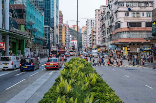
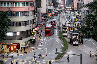
BEFORE AND AFTER 
BEFORE AND AFTER DEMONSTRATIONS AND STRIKES


VIOLENCE USED THROUGHOUT THE MOVEMENT HAVE DESTROYED PUBLIC INFRASTRUCTURE AND PLACES IN HONG KONG