Friday, 29 March 2019

OUGD406 SUBMISSION BRIEFING

monday 1:30 catalogue
tue 1:30 map deadline

catalogue number, name, very brief description of map, instagram handle 

1080px x 1080px jpeg 

deadline 5april 1:30 

sb1
  • design boards
  • map (for tue, n actual submission) 

sb2
  • design boards
  • upload blogs max 5mb 
—> contextual references 
—> own research
—> evidence of project plannings 
—> evaluation, reflecting regularly 


  • act on feedback
  • extensive design development wide range of media and approaches 

blog
  • contextualise, research, reflect

production is important!!
  • maps sold be well made, not mockups
  • pay attention to details (titles n keys…)
  • use digital print if screenprinting didn’t turn out well 

knowledge n understanding 
  • understanding the relation btwn formal language, visual comm and prob solving
  • final design —> high standard
  • all elements sold be considered and resolved 
  • —> layouts, formats, fonts —> everything tested, n works 
  • prove that the research into type, layouts…
  • —> wt ease your design prob
  • im making a map of _, \what am i trying to comm, my comm probs are_, how u using type, alyout, format, to solve the problem —> commmunicate your message, theme

cognitive skills 
contextual 
  • critical awareness
  • intentions in the production and contexutualiztion of work
  • eg of designs, data visualisations, maps 
  • dun just describe, need analyse —> ideas, principles, how they comm their ideas 

conceptual 
  • into your theme 

practical 
  • grids
  • folding techniques 

  • analyse the ideas n intentions behind your research 
  • talk about both ur n ppl’s intention 
  • justified 
  • based on research on theme 
im choosing the idea of _ to visually comm the idea of ____-

practical n pro skills 
  • identify appropriate conceptual approaches 
  • why you did xxx
  • development should be informed by high level of evaluation 
  • wide range of distinct idea 

(technical competence)
  • incorporate visual skills and sensitivity to appropriate media
appropriate 
  • methods, tech, matierials —> links to research

investigate 

identify
  • why chose animation, video, digital print, scrnprint…

transferable skills 
  • manage time and resources in order to document, present and evaluate 
  • project management 
  • present work clearly 
  • blog n design boards —> consistent engagement with development of work

SB1
  • rationale 
  • explain idea
  • exp visual lang
  • how u comm’
  • design decisions link to research
  • exp how u used design principles 
  • show final map

  • research
  • contextual —> existing maps
  • conceptual —> into themes 
  • practical
  • initial ideas 
  • grp exercise 
  • typesetting exp
  • typography 

  • design development 
  • justify all you’re decisions 
  • responses to peer review n crits(at least 2)
  • use correct terms 
  • separate them 
—> show broader range of approaches 
—> exploration on typeface 
—> symbols? 
—> manipulations of image
—> formatting 
—> animation frames 
  • final outcome
  • story board gifs 

  • evaluation 
  • engaging challenging surprises 

SB2
  • rationale (SHARED)

  • research (SHARED)
  • context: existing exhibitions 
  • concept: theme 
  • practical: 
  • initial ideas (SHARED)
  • mind maps 
  • sketches 

  • design development (INDEPENDANT) 
  • how you dealt with consistency 

  • final outcome (INDEPENDANT)

  • evaluation (SHARED) 

Tuesday, 26 March 2019

DIGITAL CLOCK ANIMATION (USING YOUTUBE TYPEFACE)

As the Youtube typeface that I created looks really digital. The typeface look really like the font that is widely used on digital clocks. It is chopped into sections horizontally as the grid system has some empty gaps in between column of grid. The sectioned characteristic of the typeface is what makes it look like the digital clock typeface. 
Also, time is the main element of the 2maps that I created. One represents daytime and another represents nighttime. I thought I would be a good idea to emphasise on the time concept and further develop it. Therefore, I came up with the idea of using the typeface to make digital clock GIFs. 

1ST ATTEMPT
In order to see if the idea works or not, I decided to make one simple one with the colon flashing, it does look like a digital clock and proves that this idea would work. 
FRAMES


RESEARCH
- The digital clock typeface is usually in the colour of neon green. 
- Each stroke of the typeface is made up of a long thin hexagon which makes it look as if they were being chopped into many sections. 
- The typeface uses the number 8 as its base 


In order to make the GIF more realistic like a real digital clock, I should use green. 

2ND ATTEMPT
Made another one with typeface coloured in green. I used the green from the above image, however, the neon green could not show as it is not a CMYK colour. Anyways, the result turned out to still looking like a digital clock. 

FRAMES


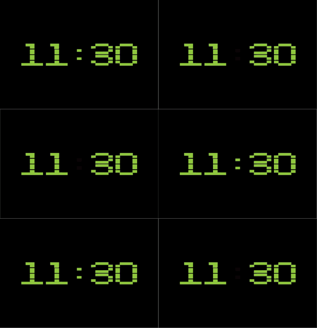
11:30-11:40
To test out the flashing colon with numbers changing, I decided to make a short one which flashes from 11:30-11:40. I made one frame for each minute and have the colon on each even number frame. It ended up with the colon not working right with the numbers. It should not flash at the same time with the numbers. 


FRAMES


REFINED VERSION
In order to make the flashing right, there should be two frames for each minute. One with colon and one without. Finally, the outcome turned out like an actual digital clock. I could carry on making the full GIF flashing from 11:30-12:30.  

FRAMES

tota:l 120 frames 

PROCESS
All the frames were being uploading onto the GIF maker website. They are being rearranged into the right order, with each minute having a with colon and without colon frame. 


FINAL GIF
11:30-12:30 
The 11:30-12:30 is made of having a with colon and a without colon version of each minute frame. The flashing colon cooperated well with the flashing minute digits. 


CONTEXTUAL RESEARCH

ELEMENTS OF A MAP

Water Towers (1972–2009) - Bernd Becher and Hilla Becher

The designers layout the photographs that they took in a grid to show the changes of buildings and architectures changes within 30 year's time. This way of communicating the idea of time is really interesting as the photographs are directly presented in a clean and organised way. The way of align them in a 6x6 grid has made differences of the buildings look even more significant. This method of present not only could directly communicate the idea of time, but also magnify the difference of the contents optically.

This image used the method of overlaying to show the 'typologies' of buildings overtime. The buildings taken over the years were being overprinted into one image and it could be seen that there are tonnes of line tracings on the picture. By looking closer to the image, you could indistinctly see that the image is actually built up by overlaying many different photographs of different buildings. This method is another way to express time apart from directly showing the difference of changes. The overlaying method is a more subtle way to portray the changes in time. In the darker areas of the image, it shows that buildings were usually built in a narrower cylinder in the past, while the areas with less tracings reflected that buildings were not usually built in a cylinder shape with a relatively wider diameter. This method of overlaying can actually give a more accurate idea of the changes in buildings over the years and at the same time creating a really interesting visual outcome. 

COLOURFUL GRAPHICS 

Using colourful elements would be an interesting way to attract audiences' attention. Also, as my map is related to listening to music, which is an activity for leisure purposes to make people feel relaxed and delighted, using bright colours for my map would be a good way to express the feeling of relaxation and happiness. When people looked at the colourful map, they are expected to have a sense of joy. 

Emotional zone - Mouvement vers l’inconnu
The idea was to study how relationship could influence our way of life and how it can generate poetical forms. By creating a visual link between memories and geography, the installation and posters are exploring how our contemporary life is creating a constant emotional and geographical landscape. The map is created with only lines and dots. This creates a really simple and good looking map, as the same time could deliver the message behind in a reply interesting way. As the map is only made of lines and dots, the key is really important to guide audiences in to really the map. This could be a doable way for working on my design as it is useful to break down loads of information into simple elements in an abstract way. Also, the map visualises smells and emotions which is something that I could try experimenting on. Working on smells, emotions, something that is non-touchable could be really fun throughout the process of visualising them in my own way. 


Diller Scofidio. AA Files 28 Autumn 1994, 90
This is an interesting way to gather loads of information into one single map. The way of branching out lines to provide and present more information is definitely a good way when it comes to a map that is highly informative. The way of making the map looking like leonardo da vinci’s sketches makes the map look aesthetically pleasing. Images were positioned in a random way, yet under an alignment system, making it looks rather neat, with a little trace of randomness. The map looks as if it contains a lot of elements, however, if you look closer, it is only made of simple lines, images and texts. This way of presenting is definitely considerable for laying out my map as it has quite a lot of information to be communicated. 

- The other way would be cutting down the information of the map. Categorising them maybe? 


Stephanie Back
Before starting the project, Stephanie had done 2 projects on the structure on the city. By the knowledge gained from those two previous projects, the third project was created. It contains cut paper maps that explore the visual and conceptual connections between circuit boards and cities. The pieces are imagined places inspired by the layout of specific cities. The idea of linking circuit boards and the structure of a city is creative. It seemed as if she got the word ‘circuit board’ from the random word generator and tired to link it with a city. It is a really smart idea as a circuit board actually looks like the complex structure of a city. This makes me think of relating my chosen theme to things that I would never thought of relating it with. Although this way of generating new ideas might not be applicable to this brief, or that I might not master this way of thinking yet, it could still be used in future projects to help me  come up with more creative ideas. 


CONCEPTUAL RESEARCH


The logo
The logo is mainly made of a round cornered rectangle and a triangle representing the "playing of videos" 
- could use triangles as the main element of my map 

The PC layout


The PC version is mainly divided into the left section and the right, with the toolbar on top. The left half is for showing some account details for people to check out and explore. (subscriptions, history, trending...) For the right half, it is for the video recommendations. 

Phone app layout


font used: Roboto 
- official type family used for Android 

regular
The regular isn't what Youtube is really using. They have stretched the font a little.

stretched


RESEARCH
- The digital clock typeface is usually in the colour of neon green. 
- Each stroke of the typeface is made up of a long thin hexagon which makes it look as if they were being chopped into many sections. 
- The typeface uses the number 8 as its base 
In order to make the GIF more realistic like a real digital clock, I should use green. 

FINALIZING DESIGN FOR SCREENPRINTING

3 OPTIONS
1. folding the 2 maps like a laptop 

2. centring n sticking the two maps in the centre of a sheet, placing horizontally so it looks like a laptop with the screen on top of the keyboard (with key aligning with the top map, the lower edge would be baseline for key)
 3. separate dots and lines of two maps, placing them in the centre 

CONCLUSION
After having a quick chat with Ben, we thought that using the second option would look the best visually with the daytime map acting as a baseline for the key. 
It fits the theme:
- laptop format (screen and keyboard) 
- with Youtube typeface that I made that ended up looking really digital 

WHAT I HAVE LEARNT
Trying out and experimenting with different layouts and where to position the maps is really to get a pleasant looking final outcome. Like where I positioned the key, when it was at the corner of the sheet, it looks weird and it feels like the key is not a part of the piece. After doing what Ben suggested, to have the key aligning with the fist maps and has it act as a baseline, the final outcome looked a lot more comfortable to look at. The whole design looked cohesive and every element worked well with each other. 

Also, folding the maps to have them look like a laptop was a really good idea, however, it might be technically not doable as there will be marks after folding it or sticking the two maps together. Other than keep on thinking of what I could do to make it work, I can think of another solution that could also communicate the idea of making the piece in form of a laptop. Therefore, the final idea of having the two maps stuck vertically would be the best choice which is technically doable and fulfils the concept. The outcome is going to look a lot more professional than the folding idea. 


POSITIVES